Stakeholder Radar Diagram
What is it?
A stakeholder radar diagram is a simple way of visually showing stakeholder information along multiple vectors or areas of interest at once.
Why do it?
The radar diagram can help identify those stakeholders who are important for different aspects of the project or for the overall project success based on multiple criteria.
How do I do it?
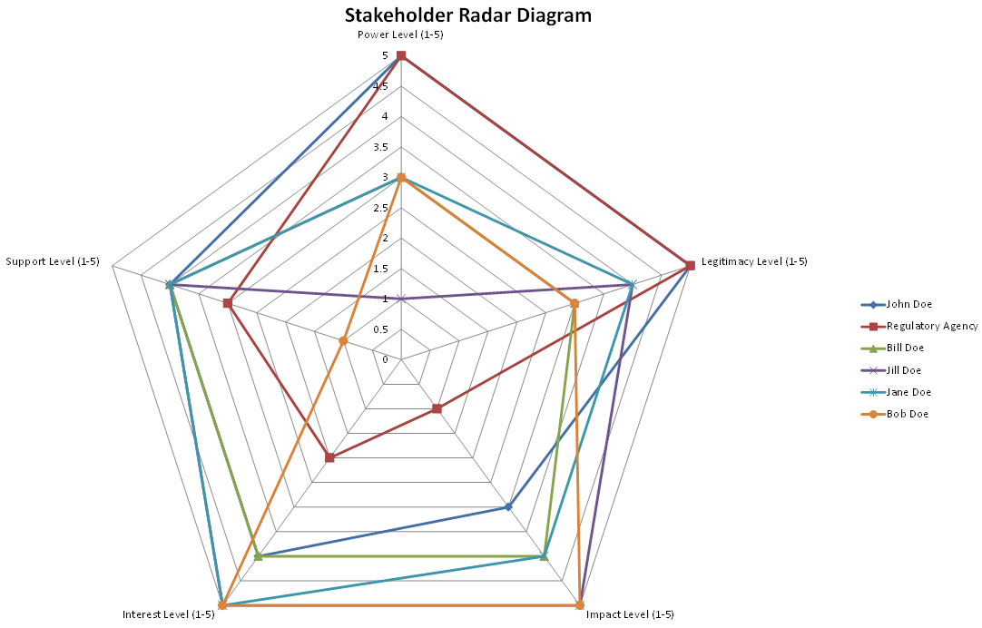
The radar diagram is extremely simple to create and is a standard chart option within Excel. Simply rank different stakeholder aspects on a consistent scale, select the columns, and choose the radar (also known as a spider web) chart option in Excel. Excel will then render the chart such as the one below which ranks specific stakeholders along axes of power, legitimacy, impact, interest, and support. A common scale of ranking from 1 to 5 was used for each aspect.
What Should the Results be?
The results would look something like this:

Those stakeholders who are charted closer to the edge of the chart are those who are most important on that specific aspect. By looking at those stakeholders who are consistently towards the outer edge of the diagram on all criteria, you identify those stakeholders who are likely to be the most important for project success.
Risks
Because a common scale needs to be identified for all criteria being measured (such as a 1 to 5 scale in this example), care needs to be taken to ensure that the values of the scale represent a similar level of importance across all aspects being measured. Failure to do so can incorrectly elevate the importance of specific stakeholders.
Tips
- You don't just have to use a radar diagram for examining different aspects of the stakeholder, you can use it for evaluating the same stakeholder aspect (for example, level of interest or influence) across different areas of the project. For example, you could use this to identify different levels of specific stakeholder support for specific aspects of a project or specific goals or features of the solution.
- Although radar diagrams can be set up with multiple axes you probably want to limit it to 10 at the absolute most. It's also a good idea to limit the number of stakeholders being examined, as with too many stakeholders it becomes impossible to clearly identify their different levels of engagement or criteria due to the sheer busyness of the chart.
References
I originally wrote this thinking it was something I came up with on my own. But some further research has turned up a number of others that had similar ideas.
Related Resources
- None