Fishbone Diagram
AKA: Ishikawa Diagram, Herringbone Diagram, Cause and Effect Diagram, Fishikawa Diagram
What is it?
A Fishbone Diagram is a type of diagram used to show the causes of a particular problem or opportunity and to break down those causes into categories that are elaborated into successive levels of detail.[1] They were created by Kaoru Ishikawa[2] and are considered one of the Seven Basic Tools of Quality
.[3]
At its most basic, the fishbone diagram consists of a single effect or issue at the far right of the diagram (the head
) with a horizontal arrow pointing to it. From this horizontal line main branches extend vertically both upward and downward (the ribs
), with each main branch representing a single causal category.
Each category branch then has primary causes of the effect that fit in that category as sub-branches, with sub-causes branching off the appropriate primary causes in a repeating pattern until there is agreement that the root cause of each primary cause is identified (collectively the bones
).
The result is a diagram that uses a structure similar to that shown below.
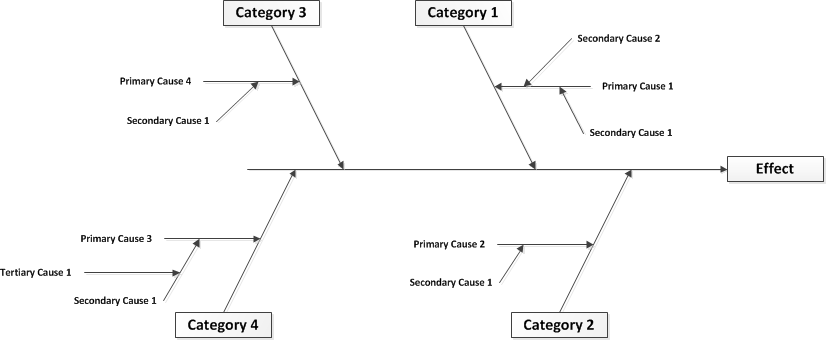
This structure helps the creators think in a systemic way by letting evaluate each primary cause in isolation (at least initially).
The Standard
Categories
There are standard categories
for various problem domains which provide a framework for the problem analysis; however it is perfectly acceptable to create your own cause categories if it seems more appropriate the problem you are investigating. Or feel free to start from one of the standards
and add or remove categories as appropriate. These mostly serve as references and mnemonics to help you ensure you are considering all possible aspects of the problem in your analysis.
The standard categories
for Manufacturing (also called the 8 M’s
) are:[6]
- Measurement
- Material
- Machine
- Milieu
- Man power
- Method
- Management
- Maintenance
The standard categories
for Marketing (also called the 7 P’s
) are:[6]
- Product
- Place
- Price
- People
- Promotion
- Processes
- Physical Evidence
The standard categories
for Sales (also called the 5 S’s
) are:[6]
- Samples
- Schemes
- Synchronous
- Skin
- Search
The standard categories
for Service work (also called the 4 P’s
) are:[9]
- Policies
- Procedures
- People
- Plant / Technology
Why do it?
Fishbone Diagrams are a primary technique used for root cause analysis. In addition the structure can also be used for:
- Evaluating the risk of an event with multiple causes [11]
- Product or Process cost analysis [7]
- Project Post-Mortem Analysis [4]
There are also variations of the standard Fishbone Diagram technique that add quantitative information such as weightings or factors that enable a more nuanced analysis of root causes based on priority or weighted impact.
Their simple visual structure makes them easily understandable to a wide audience and they are a good way to summarize information or to act as the starting point for further analysis.
The most important thing to remember though is that Fishbone Diagrams usually act as a foundation for further action. That action might be problem solving, risk mitigation, process improvement, or a variety of other actions that act to reduce the impact of the root causes identified (or important factors for non-root cause analysis). This means that the quality of resulting diagram and how well it captures the underlying factors involved can have a major impact on future efforts. If you just take a shallow pass at analysis, your future efforts are likely to be directed to the wrong areas or areas where the impact is less than it could be.
How do I do it?
Creation of a Fishbone Diagram is usually done as a team exercise but like most techniques you can do it on your own. However, if done on your own you lose the value of multiple perspectives and group knowledge that may result in a significantly stronger end product.
Step 1 – Define the Problem
The first step of creating a Fishbone Diagram is to define the problem statement that the diagram will address. The statement should be clear and agreed upon by all parties taking part in the creation of the diagram.
This statement is placed at the middle right in the head
of the Fishbone Diagram.
If the issue you are investigating is very broad or poorly defined, it may be better to create several diagrams that address more granular aspects of the problem space that can be clearly defined.
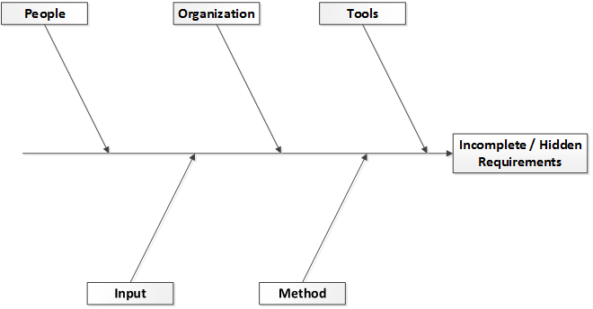
Step 1 Example
For an example, I will leverage and expand upon an actual fishbone diagram from a research paper into causes of incomplete or hidden requirements.[13] So the effect we are looking at is “Incomplete/ Hidden Requirements” and our diagram at this point looks like this:

Step 2 – Define Categories
The next step is to define the primary causal categories you are going to use (the ribs
) for the diagram and to add them. Include category labels at the end of each rib
. You can use one of the sets of standard categories
discussed above, or create your own categories.
Step 2 Example
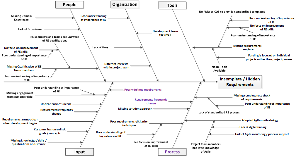
For the example I will stick with the 5 categories that were used in the research paper.[13] They were Tools, Organization, People, Input, and Method. When the categories are added to the diagram it looks like this:
Step 3 – Identify Primary Causes
The next step is to identify primary causes of the problem and add them to the appropriate rib
in the diagram. This identification could be based on actual data or could be the result of brainstorming the by participants in the diagram creation process. Alternatively, you could generate a whole list of primary causes and add them to the appropriate ribs once the initial list is complete.
Some causes may be applicable to more than one category. If so, you should add a separate instance bone
of that cause to each category rib
it is applicable to.
Keep in mind that there are three general conditions that must be met to demonstrate a causal relationship. These are:[8]
- The cause must precede the effect in time
- There must be a correlation or association between the cause and effect. In other words you are looking for relationships such as:
If X is present then Y is present
, orIf X is not present then Y is not present
, orIf X increases then Y increases
- The mechanism linking the cause to the effect must be identified
However, most Fishbone Diagrams that are created for root cause analysis are initially more exploratory in nature and so proving the 3rd condition may not always be something that is possible or necessary (especially with the data collection and experimentation that may be necessary to actually ‘prove’ the causal linkage in a formal manner). Especially because most ‘problems’ in the organizational realm are likely to have multiple causes, rather than just one.
So while meeting condition 3 above usually means ruling out all other alternative causes, when creating a Fishbone Diagram you may just want to identify other possible causes and add them to diagram. You can supplement the diagram by adding probability weights or factors to various causes in order to identify the most likely or those with the largest impact.
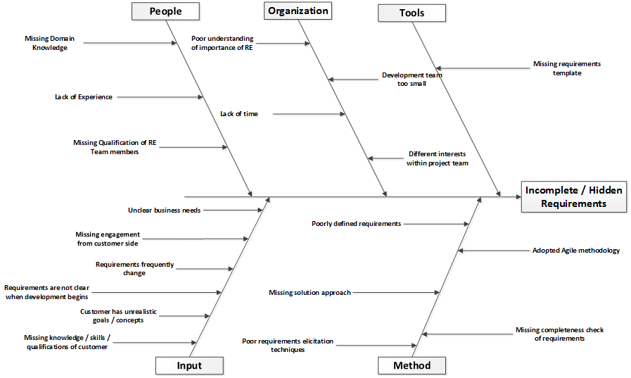
Step 3 Example
For the example I will stick with the primary causes that were used in the research paper.[13] When the primary causes are added to our diagram it looks like this:
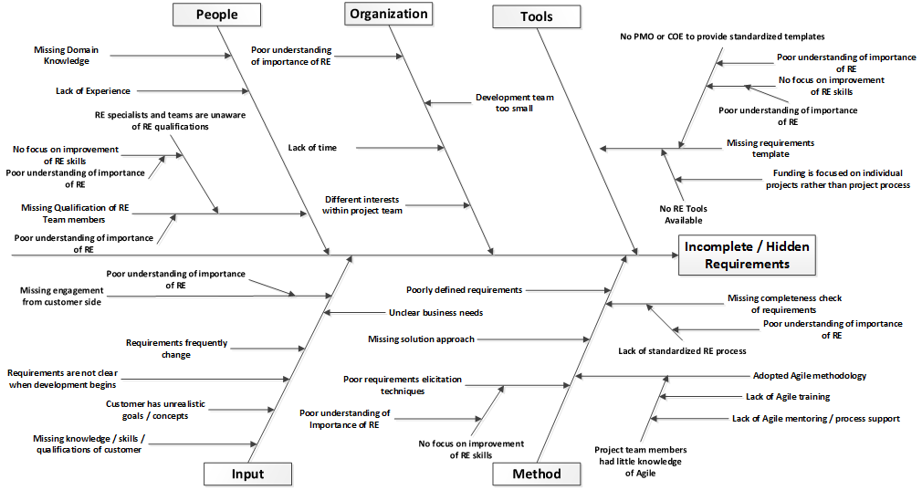
Step 4 – Identify Secondary Causes
Once you have your initial list of primary causes added to the diagram, revisit each of them and ask why
. Why is that primary factor a cause of the problem? The answers become secondary causes that are added to the diagram as branching bones
off the primary cause bone
you are analyzing.
You should continue to ask why
and add more sub-branches, or even sub-branches off of sub-branches, until you feel you have arrived at a root cause (or causes) for that primary issue. This may involve going down several ‘levels’ and essentially an undertaking of the 5 Why’s
technique.
For example, if a primary factor of a problem was Users weren’t trained in the system
then your further levels of analysis might show that:
- There are no support team members with sufficient knowledge to train users on the system
- There are no support team members with sufficient knowledge because none have been sent to
power user
orsupport staff
training courses provided by the vendor - No support team members have been sent to
power user
orsupport staff
training courses provided by the vendor because there were no funds in the training budget to send them with - There were no funds in the training budget for these courses because there was no need identified for the training and a corresponding increase in the training budget was not asked for
- There was no need for training identified because during the vendor analysis and contract negotiations user training needs and costs were not asked about or evaluated
- User training needs and costs weren’t asked about or evaluated because they are not part of the standard vendor analysis and negotiation process
Step 4 Example
The diagram in the research paper I have been re-creating up to this point only went as far as the primary causes, so from this point forward I will just make up enough (semi)plausible changes to demonstrate what I am talking about. In fact, the diagram is going to beat you over the head with a single point to make things easier later on in the example. When the secondary causes are added to our diagram it looks like this:
Step 5 – Refine the Diagram
At this point it’s a good practice to refine the diagram by pausing and asking the following questions:
- Was the problem statement too general and is my diagram overwhelmingly complex? If so, can it be simplified by modifying the statement or splitting the diagram into multiple diagrams that address related problems?
- Do all of your categories still make sense? Should you add or remove any?
- Can some of your primary causes be combined or clarified?
- Have you analyzed each primary cause to a sufficient level that the driving factor or factors has been identified?
- If primary causes are duplicated in multiple categories are their causes largely distinct to the category they are present in or can they be consolidated into a single category?
Step 5 Example
For purposes of the example, I am going to say that we decided one category name could be clearer (changing Method
to Process
) and that a few of the causes in the diagram should be moved to different categories. All of the changed elements are identified with a purple in the diagram below:
Step 6 – Analyze / Enhance the Diagram (Optional)
Once the diagram has been refined it is a good idea to supplement the diagram with visual cues or weighting values to identify the level of impact or likely impact that each of the categories and causes have. The goal with this step is to increase the usefulness of the diagram by highlighting the most important findings, identifying finding types, or by supplementing the information in the diagram to allow for greater utility of the diagram.
This might be as simple as bolding the description of the single primary cause under each category that is perceived to have the largest impact on that category. Or the single primary cause for each category that should be addressed first (which may not always be the one with the largest impact). You would then repeat that process for each primary cause to identify the single secondary cause with largest impact or highest priority. And again for the tertiary causes of each secondary cause. And etc.
Another option is to use color codes on the causal text to identify priorities or impact levels (high, medium, low). Or for identifying the organizational unit or external entities that ‘own’ responsibility for the various causes that were identified.
Or you might supplement the textual labels of the diagram with weighting values to add a qualitative dimension to the diagram. For example, based on the information captured and assuming a 100% total ‘cause’ for the effect being analyzed, what percentage of the overall impact came from each category? So if you were analyzing a Service issue with the 4 P’s standard category set, the categories might break down like this:
- Policies (20%)
- Procedures (30%)
- People (35%)
- Plant / Technology (15%)
Then you would repeat that step but evaluating the impact of only the primary causes on the category. Then repeat it again for each primary cause. And again for any secondary causes. And etc.
Step 6 Example
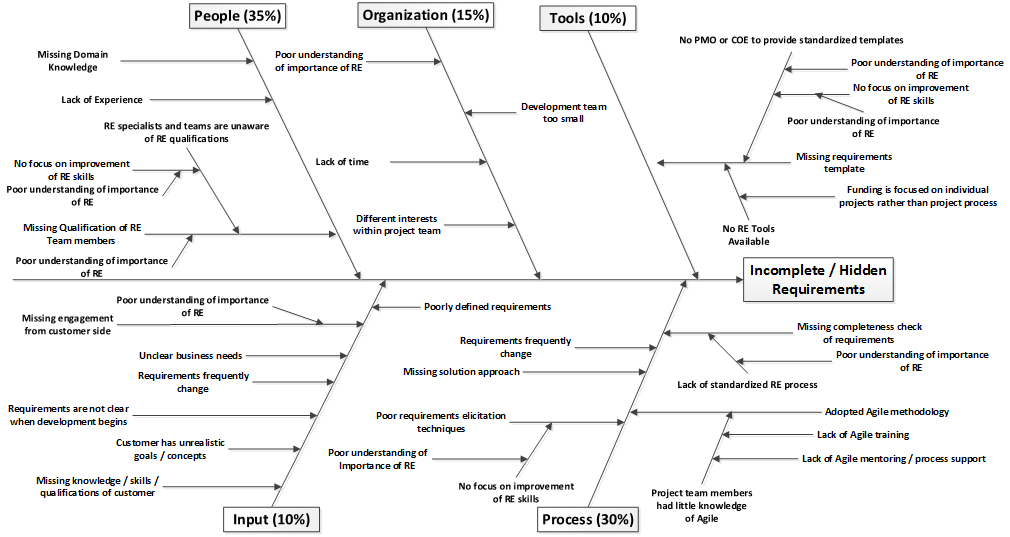
For the example the only change I am going to make it to weight each of the categories with a percentage value indicating the level of impact the accumulated causes are thought to have on the effect that is being analyzed. In theory, this would help us identify priority areas for future changes.
With that simple change, the diagram now looks like the one below:
Step 7 – Identify Important Root Causes
The next step is to look for the important root causes across the entire diagram that will be the focus of whatever the next steps will be. These could be the causes that appear under multiple categories[5]; that had the highest weighted impact scores, or that the evaluation team feels are the most important ones to address.
Your situation may be simple enough that there is only 1 or 2 actual ‘root’ causes, but in most situations there may be more ‘root’ causes than you can easily address within the time, scope, or budget you are operating under. In that case you need to identify which are the most important ‘root’ causes for getting the goals you desire.
Step 7 Example
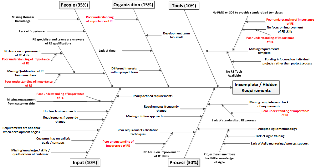
As you can see from the diagram below I have identified a single recurring underlying root cause for a great many of the primary causes I identified.
What Should the Results be?
The end result should be a diagram that identifies the root cause(s) of the effect that is being investigated. If there are multiple causes, hopefully the diagram has helped to identify the most important ones and provided some insight as to whether significant improvement of the main effect can be achieved by a few focused efforts or if there might need to be a lot of changes and work done is many areas in order to achieve the desired level of improvement.
Example of Final Results
Going back to the example, the end interpretation of the diagram would be something like this:
Hidden and Incomplete Requirements are a regular occurrence because the organization does not understand the importance of RE which means that there is no attention paid to improving people (through better hiring, training, or developmental opportunities); RE processes (through a center of excellence, standardized RE process, RE tools, and process specific training); and organizational awareness (which should drive increased engagement from stakeholders and the assignment of higher quality resources to RE efforts). Therefore, we should focus on increasing awareness of the importance of RE as a driving force in order to enable many further changes that would result.
One thing that should be clear from the sample is that a fishbone diagram can easily get VERY complex. It should be obvious to you that I skipped a lot of opportunities to dive further into the primary causes and identify more sub-causes. And that the sub-causes I used in the example were simplistic.
If you were to create a diagram on this same topic for your organization (and I encourage you to give that a try, it’s something you can probably do as a great exercise with your peers) that you may end up with 4 or 5 sub-cause levels before you get agreement on ‘root’ causes.
However, if you don’t go to that level of detail the value of your analysis is likely to be severely compromised.
The Outline Option
An additional non-diagram option for capturing the same information as in a fishbone diagram is to use a simple hierarchical list as shown below.[10] This is also a great way to create the ‘first draft’ of your diagram while you busy brainstorming so that you aren’t worried about having to move causes around for clarity and readability.
Effect: Incomplete / Hidden Requirements
Cause:1. Tools
1.1. Missing requirements template
1.1.1. No RE tools available
1.1.1.1. Funding is focused on individual projects rather than project process
1.1.2. No PMO or COE to provide standardized templates
1.1.2.1. Poor understanding of the importance of RE
1.1.2.2. No focus on improving RE skills
1.1.2.2.1. Poor understanding of the importance of RE
2. Process
2.1. Missing completeness check of requirements
2.1.1. Lack of standardized RE process
2.1.1.1. Poor understanding of the importance of RE
2.2. Requirements frequently change
2.3. Missing solution approach
2.4. Adopted Agile methodology
2.4.1. Project team members had little knowledge of Agile
2.4.1.1. Lack of Agile training
2.4.1.2. Lack of Agile mentoring / process support
2.5. Poor requirements elicitation techniques
2.5.1. No focus on improving RE skills
2.5.1.1. Poor understanding of the importance of RE
3. Organization
3.1. Development team too small
3.2. Lack of time
3.3. Different interests within project team
3.4. Poor understanding of the importance of RE
4. People
4.1. Missing domain knowledge
4.2. Lack of experience
4.3. Missing qualifications of RE members
4.3.1. Poor understanding of the importance of RE
4.3.2. RE specialists and team members are unaware of RE qualifications
4.3.2.1. No focus on improving RE skills
4.3.2.1.1. Poor understanding of the importance of RE
5. Input
5.1. Poorly defined requirements
5.2. Missing engagement from the customer side
5.2.1. Poor understanding of the importance of RE
5.3. Unclear business needs
5.4. Requirements frequently change
5.5. Requirements are not clear when development begins
5.6. Customer has unrealistic goals / concepts
5.7. Missing knowledge / skills / qualifications of customer
Advantages
- Helps to identify the root cause of a problem
- Is encouraging of group participation (if created as part of a group)
- Leverages group knowledge (if created as part of a group)
Disadvantages
- Even with software such as Visio, the Fishbone Diagram structure is NOT simple to make modifications to once it is populated. And if you are creating one on a whiteboard or paper, changes can be a hassle or require you to re-draw the diagram from scratch.
Tips
- When creating the diagram be sure to keep focused on the causes of the effect and not symptoms of the effect. [12]
- If you are working with a dispersed team, face scheduling challenges with getting everyone together for as long as you would need, or just want to create an initial ‘straw man’ fishbone diagram for a problem it’s a good idea to start with an open-question survey that is sent to a wide group of impacted parties. You can then extract key factors and categories from the answers that are provided to give yourself a head start.
- It’s often easier (and MUCH quicker) to start with capturing the information in the outline format discussed above under
What Should the Results Be?
or by using Mind Mapping software. Once you have taken the first pass or two you can adjust the major categories or refine the wording of causes, which should let you quickly create an initial Fishbone Diagram that just needs to be refined and which is unlikely to need major revision.
References
- Wikipedia Entry: Ishikawa Diagram. By Various Authors. Accessed on June 14, 2016.
- Wikipedia Entry: Kaoru Ishikawa. By Various Authors. Accessed on June 14, 2016.
- Wikipedia Entry: Seven Basic Tools of Quality. By Various Authors. Accessed on June 14, 2016.
- Research Paper: Augmenting Experience Reports with Lightweight Postmortem Reviews. By Torgeir Dingsoyr, Nils Brede Moe, and Oystein Nytro. Lecture Notes in Computer Science 2188, Edited by G. Goos, J. Hartmanis, and J. van Leeuwen. 2001.
- Article: Fishbone Diagram. No Author Identified. On the Minnesota Department of Health website. Accessed on June 14, 2016.
- Article: The Ultimate Guide to Fishbone Diagrams (Ishikawa / Cause and Effect). Nishadha Silva. On the Creately.com website. 12 March 2014. Accessed on June 14, 2016.
- Research Paper: Cause-Effect Analysis for Target Costing. By Richard C. Chen and Chen H. Chung. Management Accounting Quarterly. Winter 2002.
- Article: Understanding Causal Systems. By David N. Card. CrossTalk Magazine. October 2004.
- Article: The Cause and Effect (a.k.a. Fishbone) Diagram. By Kerri Simon. On the iSixSigma.com web site. Accessed on June 14, 2016.
- Article: Fishbone Diagram. No Author Identified. On the MoreSteam.com web site. Accessed on June 14, 2016.
- Research Paper: Application of Fishbone Diagram to Determine the Risk of an Event with Multiple Causes. By Gheorghe Ilie and Carmen Nadia. Management Research and Practice, Vol. 2, Issue 1.
- Article: How to Use the Fishbone Tool for Root Cause Analysis. No Author Identified. On the Centers for Medicare & Medicaid Services web site. Accessed on June 14, 2016.
- Research Paper: Preventing Incomplete/Hidden Requirements – Reflections on Survey Data from Austria and Brazil. By Kalinowski, Feldere, Conte, Spinola, Prikladnicki, Winkler, Fernandez, and Wagner. International Conference on Software Quality 2016. January 2016.
Related Resources
- Research Paper: Technical project management using quality methods. By Aleksander Gwiazda. Journal of Achievements in Material and Manufacturing Engineering. December 2008.
- Research Paper: Total Quality Management in Software Development Process. By Eldon Y. Li, Houn-Gee Chen, and Waiman Cheung. The Journal of the Quality Assurance Institute, Vol. 14, No. 1. January 2000.
- Research Paper: Evidence-Based Guidelines to Defect Causal Analysis. By Marcos Kalinowski, David N. Card, Guilherme H. Travassos. IEEE Software.